
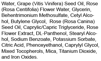
Sometimes it can be hard to make the ingredient declaration fit on the label.
All Those Ingredients!
Some cosmetic products have many ingredients. That’s especially true if you have blended color additives where all of the individual components need to be listed, or when you want to include the scientific name for botanical ingredients.
The ingredient declaration must be at least 1/16 of an inch high, measuring an upper case letter when the text is in all uppercase, or measuring the lower case “o” when both upper and lower case are used.
Tip
Use a slightly condensed (narrow) font in all capital letters for the ingredient declaration so it takes up less space.
Compare the same ingredient declaration in different fonts. The lower case “o” in the upper and lower case measures the same as an uppercase letter in the all upper case text!

Leave a Reply